Martial Arts App
Client:
Caio Terra Academy
Year:
2024
Role:
UX UI Design
Industry:
Martial Arts
Technology:
iOS, Android, Web
Tools Used:
Figma
Photoshop
A Visual Refresh Becomes Core Improvements
In 2024 I worked with Caio Terra Academy to redesign their app and website. Our work began with redesigning the app, and over time my responsibilities evolved to include a website redesign. I worked with engineers and company stakeholders and interviewed subscribers for this project. I followed a user centered design process and worked with engineers to implement the build.
The Problem
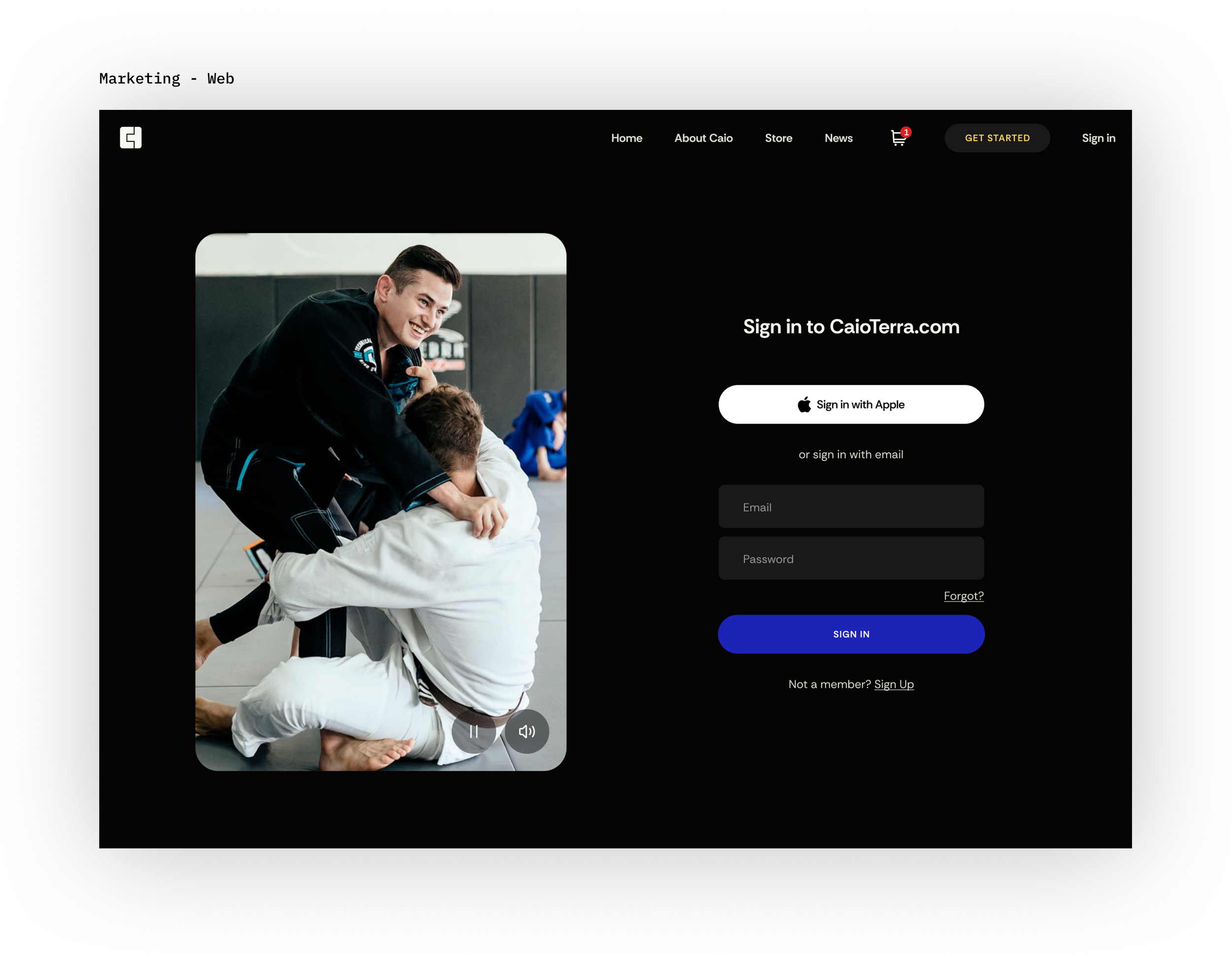
The app for iOS and Android was built by an engineer using React Native. The previous app build was working, but the company wanted the app to work for Android as well, so the engineer for this project chose to use React Native and design the app himself while working. The app was functional for users who signed up already in the website, but it lacked a way to sign up or subscribe in the app and the company owner was not happy with how it looked visually. We started off with a redesign to focus on these two aspects: signing up new users and visually refreshing the app to be more competitive in the modern market.
Secondly, we also wanted to increase user engagement and prevent subscription cancellations after belt testing. A similar pattern was observed that students would sign up before their belt test to study for the test, then cancel once the test was over. While the subscription served their need to study, we hoped that we could retain these users once the test was over. To solve this problem, we interviewed users and made hypotheses on what kinds of changes would interest them in keeping the subscription longer.
The Process
I followed a user centered design process emphasizing strategic improvements with businesses and users. We started off with a whiteboarding intake session where we laid out all the needs of the business and the users. We planned the overall structure and changes. Next I interviewed users in the gym and asked them some basic questions about the subscription, what they liked and disliked. Based on their responses we would sometimes follow up with additional questions. Based on these insights, we found some general trends that informed our hypotheses for how to solve our business and user problems.
The Solution: New Functionality And Visual Refresh
Based on user and market research, we decided the best way to interest users beyond the belt testing was a feed of content that would have various interest points besides just testing. It would accommodate test studying but also suggest interesting content from across the library. We noticed during research that since videos were shown chronologically, older but interesting videos got hidden. Because we imagined that if users were more aware of the various kinds of interesting content on the platform, then they would be more likely to stick around. This combined with additional functionality to allow users to study for the tests we hoped would contribute to a longer subscription period.
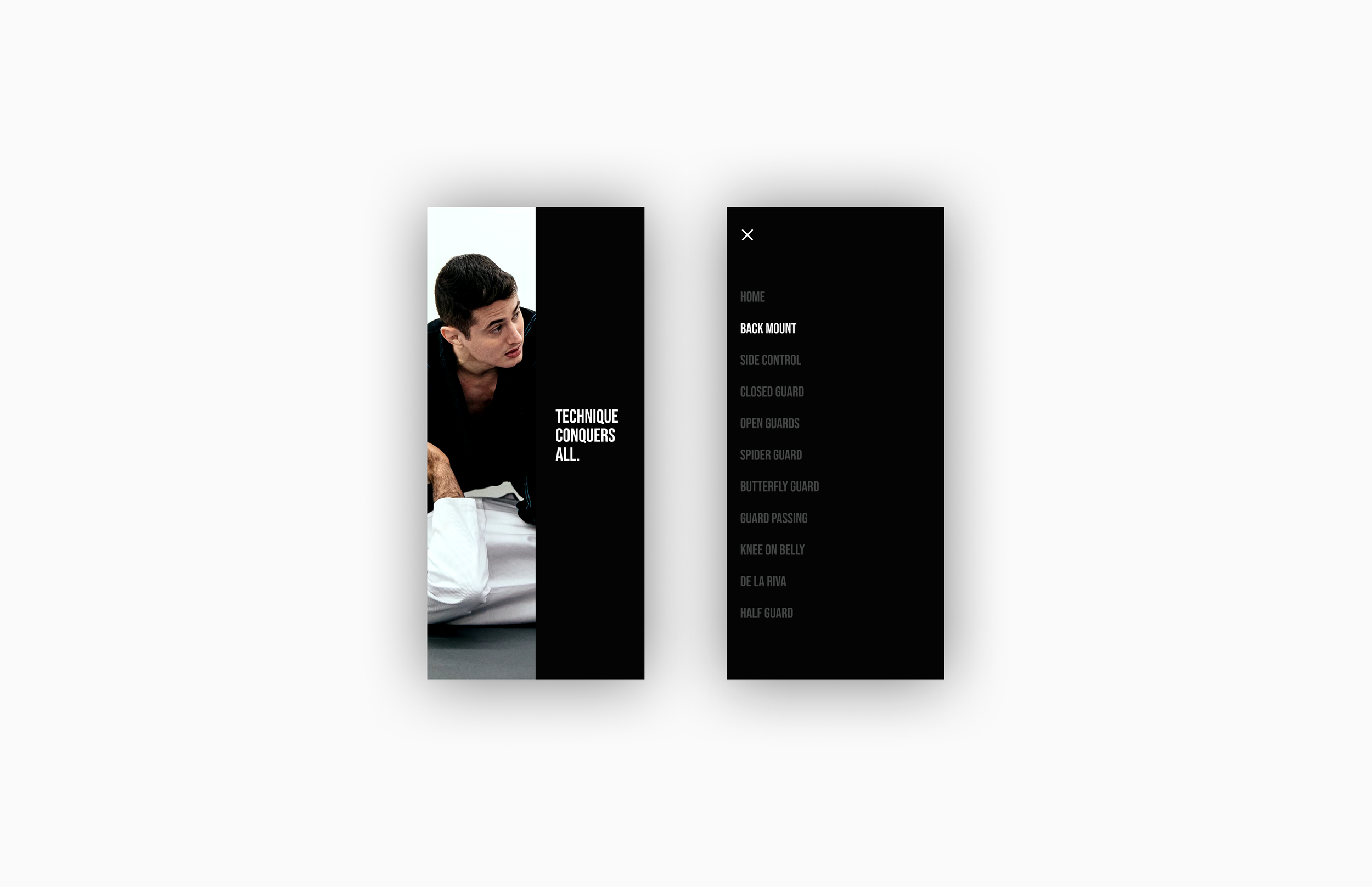
Also we solved the problem that we initially set out to solve, which was allowing users a way to sign up and subscribe for a new subscription, and a visual refresh. The visual refresh focuses on dark colors with a gold spot color, and modern typographic treatment. The thumbnails are larger and we use scrolling carousels to allow easily scrolling for content. This combined with an infinite scrolling feed we hoped would modernize the look and feel of the new app design.