About

Thanks for visiting my portfolio! My name is Lee Beckwith, I'm a product designer from the Bay Area, currently living in the American Midwest. I have around 13 years of professional experience as a designer since graduating with a Masters in Human-Computer Interaction Design. My professional interests include typography, interaction design, and detailed user flows. As for personal interests, recently I've taken an interest in clothing construction and design, and PC games like League of Legends. Thanks for visiting and I look forward to connecting with you.

As a bonus, here is some additional info behind the design process for this portfolio website. This whole site was designed myself starting from pen and paper to Figma, Webflow, and a tiny bit of custom code.

Wireframe of baseline concept
Mockup exploring using device mockup photography as driving visual force
The project details as an overlay modal and having the entire "site" be on one page is the central interaction concept.
Although I used webflow, there are a ton of details that require either custom javascript or hacking with webflow animation features, loading things into the DOM and so on, that probably no one will consciously notice.

Research and concepts

Since I'm also a UX designer I suppose we should mention the users and research. I studied a fair amount of other designers portfolios and watched video reactions of portfolio sites by hiring managers. I also listened to expert advice on portfolio design from a few design teachers. I purchased several portfolio design instructional products. Some were for case study collaboration, others for portfolio visual design, others contained extensive research on design portfolios employed at prestigious companies and contained narrated walkthroughs where hiring managers viewed portfolio sites and told us their thoughts. I also conducted research on what factors improved portfolio success and what factors took away from it and I'll mention some of those below.

Based on the research of what worked, I decided to incorporate a few points. I didn't incorporate every single point from the research because some - the big smiling photo with a blurb about pets and hobbies - would feel inauthentic and since I look at this site a lot, I wanted something I'd be happy with personally as well.

Here are the research insights I did decide to incorporate:

1. Showing projects right away. Sometimes hiding projects under a banner or having to scroll can be annoying for hiring managers who only spend about 1 minute on average per portfolio.

2. Having too much information in projects. The reality is my users are not reading projects in their entirety. A good rule of thumb is they will read the headings and perhaps a single sentence of each paragraph at best.

3. Some users will only look at the landing page and may not click on any projects at all.

4. The projects that receive the most clicks are always the one highest on the page.

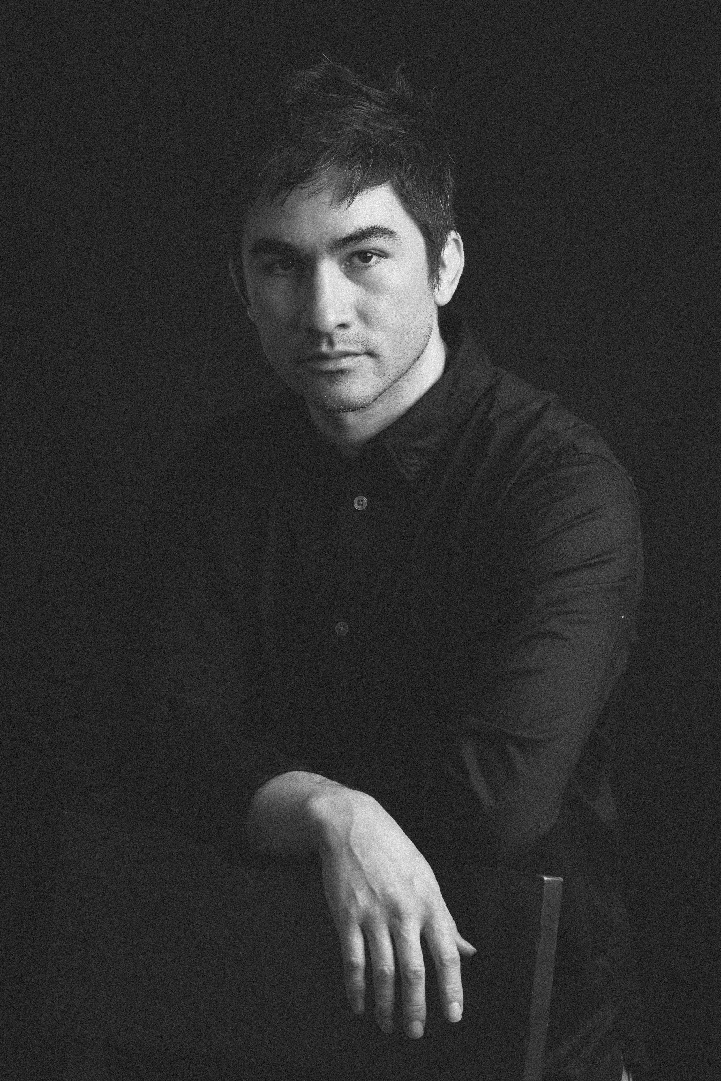
5. In the video reactions of portfolios there was a lot of emphasis from the hiring manager on the perceived personality of the designer based on their photograph. I am not happy with my current profile photography selection and want to get a new set done to be more welcoming and friendly looking. My last photography session was done to be creatively inspired by photographs of famous designers and creatives. But I've received feedback from a recruiter and a career counselor that the photographs are too serious and not welcoming enough. On the one hand I want to be true to myself and not have an overly jovial, mouth-open, teeth-showing smile. I would feel like I'm betraying myself a bit to do that. However I also want to present a friendly image. I really do think I'm a nice person. So because I don't have a photograph that strikes a good balance, I decided to not show photography and take whatever setbacks that decision causes. I suppose my audience can get to know me during interviews or if we work together instead, and when I have adequate photography I will put that back in.

So basically my core concept comes down to the following principles:

1. I wanted a simple site that has a core design principle rather than chasing trends and having a long scrolling site with lots of flashy elements.

2. Side navigation that sticks to the page instead of typical top navigation

3. Grey background to create a soft under-construction feel

4. Single column vertical scrolling project area

5. Mockup photography as driving visual force and driving creative direction. Mockup photography was carefully chosen out of the options out there as it would be the first thing users see. I wanted photography that would be versatile by being simple and not have too much distracting background elements, e.g. shadows, plants, coffee cup, etc.

6. Actually using IBM Plex Sans has a major impact on the feeling of the design, further emphasizing the sort of under construction, behind the scenes feeling to it

7. I looked at some Evangelion computer interfaces in the inspiration for the loading screen. I wanted there to be a feeling of retro-futurism to it, kind of computer-core if you will.

8. For this design I didn't want to have too much going on on the home page, like a narrative about everything about me. Instead I wanted to treat the portfolio almost like a business card.

9. Each project would only have 4-5 large images with 4-5 sections of text. I felt this was the perfect length for the amount of time a visitor spends on my portfolio site before making a decision. The imagined flow is they will land on the home page, scroll a bit, click on probably just one project, scroll a bit, and then close the site having made a decision. Given this type of flow I want every single piece of that experience to have an optimal and trustworthy feeling to it. The fewer elements that can distract from this flow, the better.

10. Interestingly according to research, testimonials and reviews actually have a negative correlation with portfolios receiving interview invitations. I find this pretty interesting and I'm not sure why this happens. My last portfolio has testimonials but for this one I decided to take them out because of this research point.

11. I used to have also a blog post section because a design educator suggested having Medium articles is a good piece of influencing material. Perhaps it is. But, since I no longer write on Medium and I'm not really happy with the type of writing that typically happens on there I decided to take it down for this one. My preferred writing style tends to be a bit longer and more academic. I found that pandering to the style of Medium articles didn't feel authentic and that I was betraying myself by doing that. So to stay true to myself, I decided to focus this portfolio version purely on the work, and to have this about section that visitors will probably not read but can if they wish.

One of the most important concepts: 

12. I spent a lot of time on small details that visitors may or may not notice. That's a very critical and core concept. In Chronotrigger, there is a level where if you stay in the room for a few hours, a maid comes in and cleans up the room you were staying in, and you can interact with her. This is a secret detail not many people know about. But they put it in anyway. So while I don't have any interactions that take hours to view, I did put extra effort into the animation for the arrows on the sidebar, the loading animation, and the blurring and fading of the project overlays. It took a lot of time to get these details right and testing on different browsers. I wrote custom javascript to get the animations to look right, and honestly they're not flashy and probably most people will not notice. It's something that may not be seen, but can be felt. It's core to my concept of doing fewer things but at a higher quality with more detail.

About the "about" page:

I have often noticed portfolio about sections mentioning such mundane and vaguely pleasant things as pets and hobbies. That's all fine and good. But I've never really felt like mimicking this common decision would be authentic. As a recurring theme you may have noticed that being authentic is important to me. I think that a portfolio website is one of the few times a designer can design a "product" for themselves in a way. Of course my user is hiring managers, but it's also myself. As opposed to professional projects where the users are other people, this portfolio site is mainly looked at and used by myself. The purpose is to advertise my work and to get job interviews. But, I also wanted to make something that I can be happy with and feels authentic. I don't want to have sections or information just because it was recommended. I am trying to solve the project problem: show work and get hired, while also trying to make something I can be happy with that strikes a balance between authenticity and serving my users.

Back to the point about the "About" page, while I often see a few quaint points about cats and hiking, I thought that writing a sort of essay about this website allows you to learn "about" this website design, and through doing so also get to know me a bit better.